Facebook: Thoughts On New Design
- 2017-09-14
Over the last few weeks, Facebook has been rolling out subtle design updates for their mobile app. Even though you might not notice it at first glance, it will eventually catch your eye. These changes have been accepted with mixed emotions so far (as expected with any new design module) but are sure to catch on as users get more accustomed to them. According to experts, the new design draws inspiration from none other than Instagram for most of the changes. But we'll get to that later.
For A More Rounded Conversation
The most obvious and blatant feature is probably the comments. While they were previously viewed as just a series of posts, now, every new comment pops up in its very own bubble — something on the lines of a messaging app conversation. Apparently, this design detail is to make every comment feel like a more readable conversation with that individual rather than just a thread. For some, this might come as a pleasant surprise, while others could take time getting used to it. Nevertheless, it does bring about a much-needed change to the app's look.
It’s In The Details
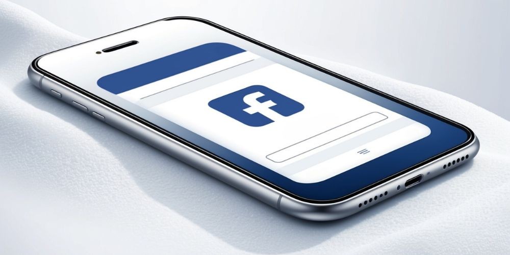
As soon as you get past the “bubble trouble” and head on into the News Feed, you might have to squint to see the ridiculously subtle changes made — literally. For starters, the ever-so-famous blue header that makes Facebook what it is has gotten a shade (or two) lighter. Definitely not something you'll notice immediately, I can assure you. The overall color contrast has also been increased to make the text brighter and easier to read. The preview links have been increased in size and now fill the entire width of the screen.
Now, this is something you might have noticed, but for a very different reason. The Like, Comment, and Share buttons have been made larger, and along with the other silhouette-styled icons found throughout Facebook, have been reduced to wireframe-styled ones — similar to those on iOS. As with most of the changes, opinions may vary, and getting accustomed to them might take a few days.
If you've happened to notice these above-mentioned changes already, that would be great. But, there are other minute details that should have and could have completely given you the slip - they did for most people. The “Back” button has been transformed from an arrow to a more prominent ‘<’ (or, as I call it ‘the lesser than symbol’). Even the links in the News Feed now let you know exactly where they're about to take you before you click on them, which is always a helpful addition.
New Looking Profiles
I've saved the best for last with this one. There is absolutely no way anyone would have noticed this about their Facebook profile before reading this. So, get into your app and check out your profile picture. See anything different? Facebook has ditched the mundane square shaped images for circular ones — someone's a fan of Twitter it seems.
So, there you have it. All the subtle and not-so-subtle changes that have come your way, or are coming your way in the next few days on Facebook's app.